
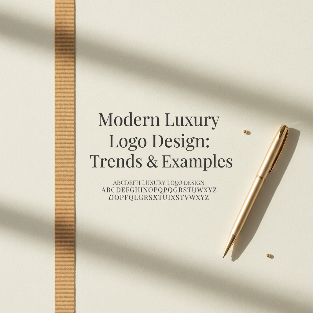
Modern Luxury Logo Design: Trends & Examples to Inspire Your 2026 Brand
Luxury has evolved. It’s no longer just about gold accents, elaborate crests, or serif fonts that feel “expensive.” Today’s luxury is quiet, intentional, and deeply confident, and the best logos reflect exactly that.
If you’re building or refreshing a luxury brand in 2026, understanding how modern luxury logos work will help you create something timeless, elevated, and unmistakably refined.
Let’s break down the trends shaping today’s luxury identity landscape with examples you can actually learn from.
1. The Move Toward “Quiet Luxury.”
The biggest shift: luxury brands are becoming simpler, calmer, and more stripped down.
Think:
clean wordmarks
softened tones
wide spacing
fewer flourishes
Luxury now feels like ease, not noise.
Examples:
Celine’s post-2018 refinement
Bottega Veneta’s minimalist sans-serif evolution
Loewe’s simplified monogram and wordmark pairing
These brands show that modern luxury signals confidence, not decoration.
2. High-End Doesn’t Mean Overdone
There was a time when luxury logos needed coats of arms, detailed initials, or ornate symbols.
Now?
Luxury communicates itself through restraint.
When you strip away unnecessary details, the viewer fills in the emotional gaps. And that is where luxury lives, in the feeling of space.
How this helps you:
Choose simplicity with intention.
Small brands often over-design because they feel they must “prove” something.
Real luxury proves itself through calm clarity.
3. The Rise of Geometry & Precision
One of the most noticeable trends in modern luxury is the return of precise geometric construction.
Rounded rectangles, perfect symmetry, grid-based monograms, and structured proportions are common across elevated brands.
Examples:
The symmetry behind YSL’s iconic monogram
The geometric construction of the Tiffany & Co. wordmark
The structural balance in the updated Burberry wordmark
Geometry creates order, and order feels luxurious.
4. The Serif Renaissance
Minimalism isn’t the only story.
We’re also seeing a rise of:
high-contrast serifs
contemporary serif–sans hybrid letterforms
custom serif cuts with delicate strokes
These styles feel premium without being old-fashioned.
Example:
The new Ferragamo redesign, a refined serif that feels modern, mature, and quietly powerful.
5. Symbol + Wordmark Combinations
Luxury brands are leaning into dual-logo systems:
a primary wordmark for clarity
a secondary symbol for versatility (embossing, packaging, jewelry, tags, social icons)
This gives your brand more flexibility and allows your logo to live elegantly in different spaces.
Example:
Chanel’s dual use of the CC monogram and full wordmark
YSL symbol used independently from the brand name
For 2026, this is one of the strongest, most scalable approaches you can take.
6. Craftsmanship in the Details
The luxury feel is no longer defined by the overall look, but the micro details:
custom ligatures
intentional spacing
refined kerning
handcrafted curves
subtle alterations to standard fonts
Even if the logo seems “simple,” the artistry is in what most people don’t notice.
This is exactly what makes it luxurious.
7. Timelessness Over Trend-Chasing
The most important rule of modern luxury logo design:
Don’t chase trends. Design for 10 years, not 10 months.
A luxury logo must age well.
It must outlive seasonal styles and algorithm-driven aesthetics.
If you’re updating your brand for 2026, focus on:
simplicity
consistency
clarity
subtle character
Luxury isn’t about being trendy it’s about being unforgettable.
Final Takeaway
Luxury branding in 2026 is defined by ease, structure, restraint, and timelessness. Whether you’re a small business owner or building an emerging fashion or lifestyle brand, your logo should feel confident enough not to shout.
Simple.
Calm.
Intentional.
That’s modern luxury.