
The Design Secrets Behind Luxury Brands: What Really Makes Them Feel Expensive
There’s something magical about the way luxury brands speak without ever saying a word. A single logo, a soft serif font, a muted color palette, suddenly you feel a sense of calm, confidence, and elegance.
As the new year begins, many entrepreneurs feel inspired to refresh their branding, elevate their visuals, or finally create the look they’ve always dreamed of. And if there’s one question I hear the most, it’s this:
“How do luxury brands make their designs feel so expensive?”
The truth is: luxury isn’t an accident, it’s a formula.
A beautifully intentional one.
Today, we’re walking through the foundational design elements luxury brands use to create that quiet confidence and effortless sophistication.
1. The Power of Minimalism (Less, but Better)
Luxury brands don’t rush to fill space; they let space breathe.
White space becomes a design element, not an empty area. Minimal layouts force your eye to focus on what truly matters: the quality of the brand itself.
Luxury design rule:
If the design feels calm, it often feels expensive.
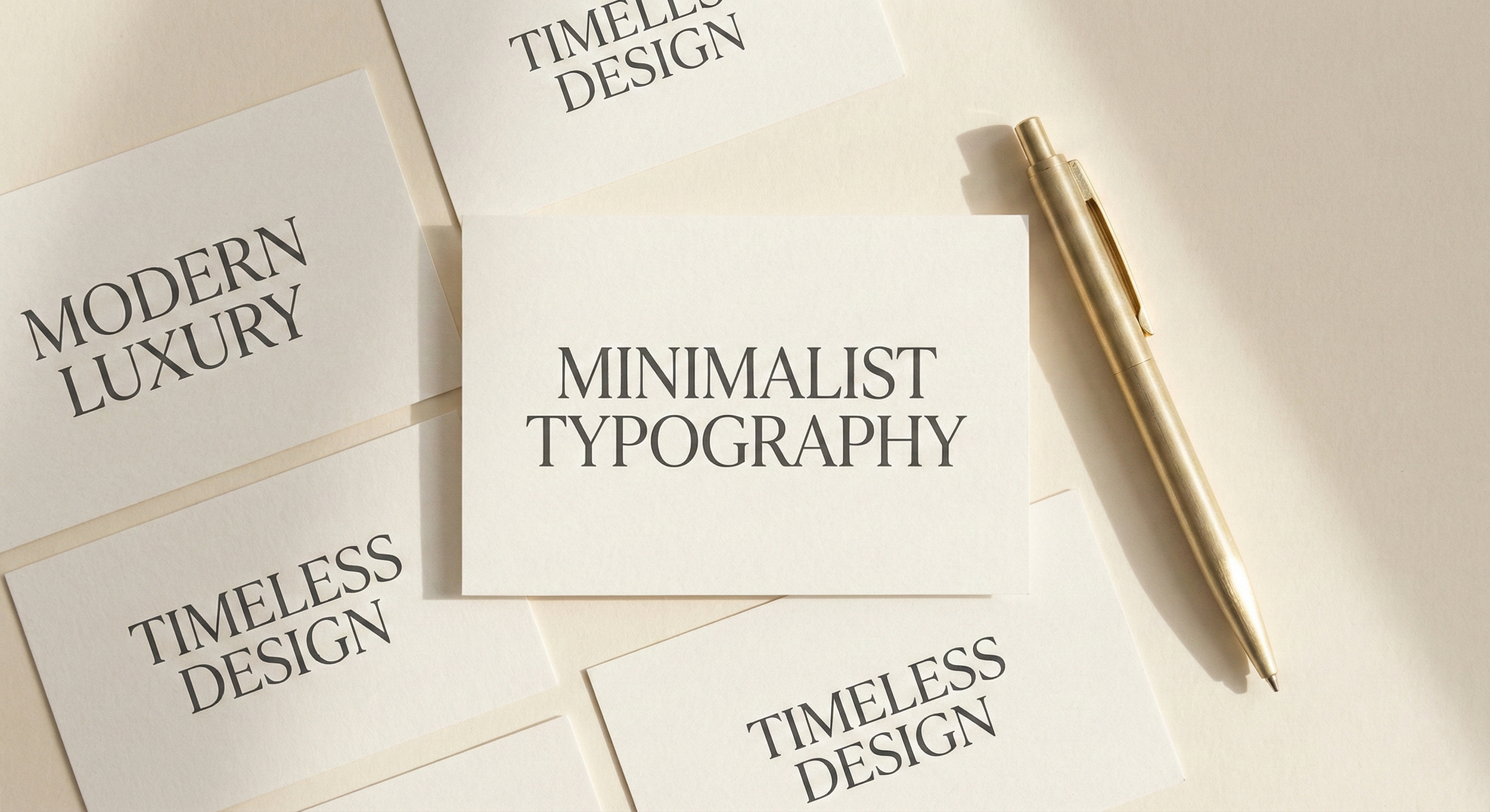
2. Timeless Typography (Fonts That Whisper, Not Shout)
Think of the elegant serifs of high-end fashion houses or the sleek modern sans serifs of contemporary luxury designers.
Luxury fonts are usually:
Clean
High-contrast
Elegant
Timeless
They carry a softness that still feels confident, never loud, never busy.
3. A Refined & Restrained Color Palette
Luxury brands rarely use bright, highly saturated colors. Instead, they lean into:
Nude tones
Deep charcoals
Soft golds
Warm neutrals
Earth-inspired blacks and creams
Colors that feel natural, grounded, and inviting, almost like a warm hotel lobby or a fresh linen robe.
4. The Emotional Element: Storytelling in Visual Form
The true heart of luxury branding is emotion.
Every detail from logo shapes to the curve of a letter, is intentional. The brand isn’t selling a product; it’s selling a feeling:
Calm
Trust
Exclusivity
Ease
Aspiration
Luxury visuals make you feel something before you even read a word.
5. Modern Luxury Trends (Where 2026 Is Going)
Even though luxury feels timeless, it evolves.
Right now, luxury design is moving toward:
Ultra-minimal modern logos
Soft monochrome palettes
Fluid organic shapes
Handcrafted serif typefaces
Editorial-style layouts
It’s a blend of classic and contemporary, quietly bold.
Final Thoughts
If you’re dreaming of elevating your brand in 2026, start with the elements luxury brands have perfected:
✨ Calm spaces
✨ Elegant fonts
✨ Soft, grounded colors
✨ Emotional storytelling
Luxury design isn’t about looking expensive; it’s about feeling expensive. Creating a world where your audience feels understood, inspired, and welcomed.
Your brand deserves that kind of beauty.