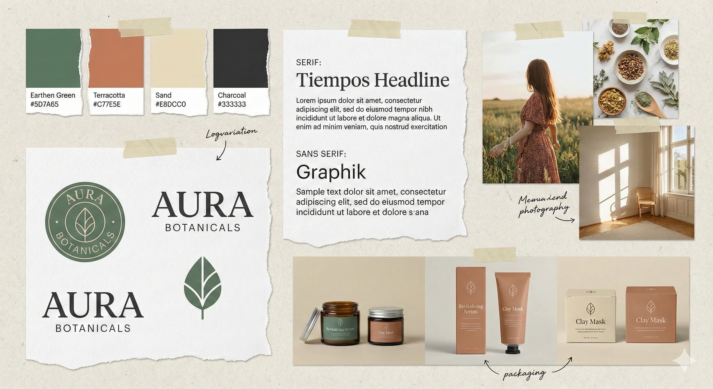
Real-World Brand Identity Examples That Actually Work
A strong brand identity isn’t just beautiful, it’s intentional, consistent, and built on a clear strategy.
The best brands feel effortless because every visual, every word, and every interaction is aligned.
Here are real-world examples of brand identities that actually work and what you can learn from them.
1. Airbnb — Warm, Human, and Universally Recognizable
Airbnb’s brand identity is built around one simple idea: belonging.
What works:
A soft, friendly color palette that feels welcoming
Clean, round typography
Their iconic “Bélo” symbol that represents connection and belonging
Photography that feels real, personal, and human
Messaging that sounds conversational and inclusive
What you can learn:
Your brand identity should reflect the emotion behind your business.
Ask yourself: What feeling do I want people to associate with my brand?
2. Glossier — Minimalist, Modern, Unmistakably Them
Glossier built an identity that is instantly recognizable even without a logo.
What works:
Their signature blush-pink color
Bold yet soft typography
Real, unretouched photography
Clean visuals with lots of white space
A voice that feels relatable, friendly, effortless
What you can learn:
Choose a signature visual element, such as a color, layout style, or tone, and use it consistently. That’s how identity becomes recognition.
3. Notion — Simple, Smart, Flexible
Notion’s brand identity mirrors what the product does: make things simple and structured.
What works:
Black-and-white, timeless color palette
Clear, minimal icon-style illustrations
A calm, intelligent, organized personality
A visual system that works across every platform
What you can learn:
You don’t need loud colors or complex visuals to make a lasting impression.
Clarity and consistency are a design style.
4. A Small Business Example: A Boutique Coffee Brand
Let’s look at a smaller, real-world example that many entrepreneurs can relate to: boutique coffee brands that build strong identities.
What works:
Earth-toned, intentional colors
Story-driven packaging (origins, farmers, sustainability)
Warm, artisanal typography
Photography that highlights lifestyle and craft
A personality that feels authentic, local, and thoughtful
What you can learn:
Your story is part of your identity.
Share it.
People connect with brands that feel human and honest.
5. A Personal Brand Example: A Creative Freelancer
A well-designed personal brand identity can be just as powerful as a corporate one.
What works:
A clean color palette that reflects personality (muted, bold, soft, etc.)
A logo built from initials or a simple mark
Consistent social media templates
A distinct tone of voice, friendly, expert, calm, or quirky
Strong photography that feels personal but polished
What you can learn:
Your identity should feel like you, not a generic template.
If someone removed your name, they should still feel your presence.
Common Patterns Across All Strong Brand Identities
No matter the industry, the best brand identities share five traits:
They are:
✔ Consistent
✔ Clear
✔ Emotion-driven
✔ Easy to recognize
✔ Intentional
When these pieces work together, your brand becomes something people trust and remember.
Final Thoughts
Great brand identity isn’t about copying big brands it’s about understanding what makes them successful and applying those principles to your own business or creative work.
The goal isn’t perfection.
The goal is connection, clarity, and confidence.
When your visual system, tone, and visuals all speak in the same voice, your brand becomes unforgettable.

