
Modern Luxury Logo Design: What Really Makes a Logo Feel Expensive
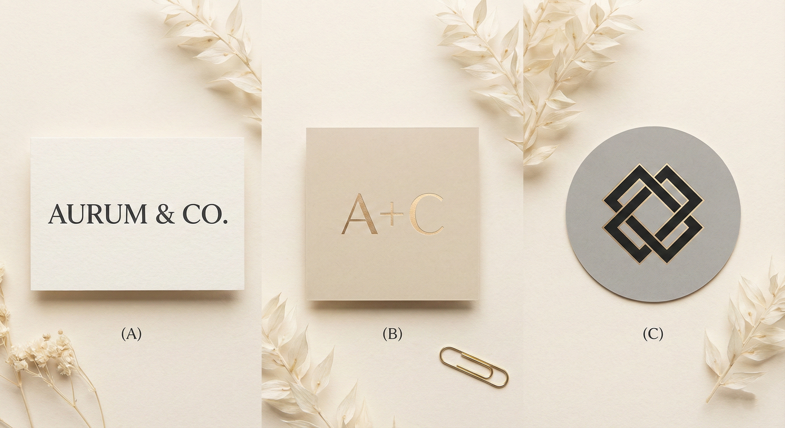
Let’s be honest, some logos just feel expensive the moment you look at them.
They’re simple, confident, and somehow carry that quiet “I belong in a glass box in a flagship store” energy.
But here’s the real secret: luxury logos are rarely complicated.
They’re intentional.
Here’s what truly makes a logo look and feel luxurious: no overthinking, no overcrowding, just design that knows its worth.
1. Clean, confident typography
Luxury brands love typefaces that feel mature and secure. Think refined serifs, elegant high-contrast strokes, or strong minimal sans-serifs. The fonts carry the attitude.
2. Space is a design element
Luxury logos breathe. The spacing, the margins, the calmness, all of that communicates confidence. Crowded logos feel cheap. Spacious logos feel premium.
3. Timeless forms, not trendy shapes
Luxury logos avoid design trends that will fade next month. Their shapes are simple, geometric, and purposeful. This is how they stay recognizable for decades.
4. A restricted, intentional color palette
Most luxury logos keep it classic: black, gold, white, champagne, charcoal. The colors whisper instead of scream.
5. The feeling of restraint
Luxury is rarely loud. The magic usually comes from what the designer didn’t add. It’s elegance through subtraction.
Conclusion
Luxury logo design is all about clarity, restraint, and timeless confidence. If your logo feels calm, intentional, and well-balanced, it will naturally carry that luxurious energy people connect with.